Page Design
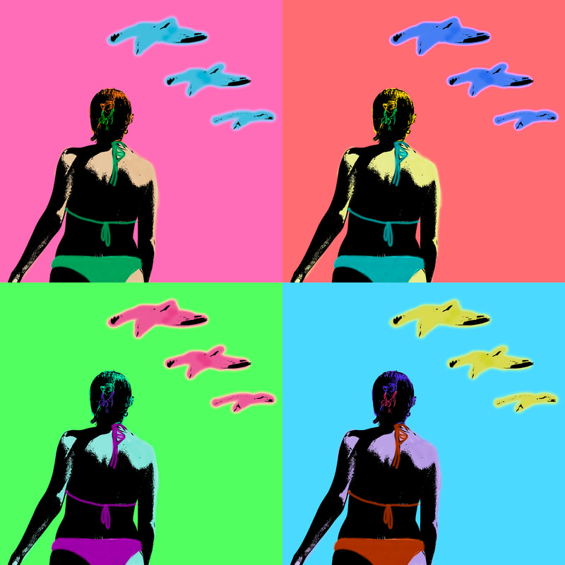
Illustrations

|
|
Infographics
|
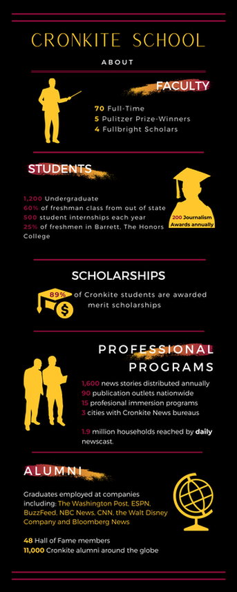
ASU's Cronkite School RedesignJMC 305- Re-designing Cronkite's Infographic. For this first infographic I tried pollishing up the text to avoid sounding redundant within the sections. For the color palet I used black, white and ASU's maroon and gold colors to have some contrast while still representing the school. I tried making the infographic like a visual staircase with the figure elements and the text. The infographic was created in canva.com
|
|
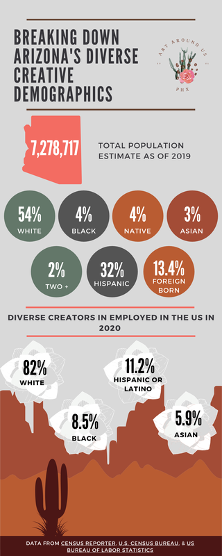
Art Around us PhxJMC 305-Group Project Infographic. For this second infographic I wanted to showcase the diverse population in Arizona and the percentage of diverse art creators employed in the U.S. as I couldn't narrow down that search demographic. This graphic helps to put into context the current number of creatives working as of 2020 in some art related job from various backgrounds. The color scheme of the infographic is meant to assimilate that of our project Art Around us PHX's palette as well as content relevant for our Art Community. The Arizona Demographics data is from the Census Reporter and the U.S. Census Bureau. The diverse creators employed in the U.S. in 2020 data is from the U.S. Bureau of Labor Statistics the data is specifically from the Arts, design, entertainment, sports, and media occupations section down in the chart. The infographic was created in canva.com
|
Website Design
|
An online resource for the art community of Phoenix. Monse Apud and her Partner Emily Perez came up with the idea of this brand as they are both art lovers who want to showcase local artists, vendors, and art exhibitions around the valley.
Monse created the design behind the logo and brand of Art Around Us Phx.
|
Click on the logo to visit us
|
All the content on this site is my own work
